Quando design vira receita
O redesign que aumentou conversão e reduziu chamadas no suporte

Introdução
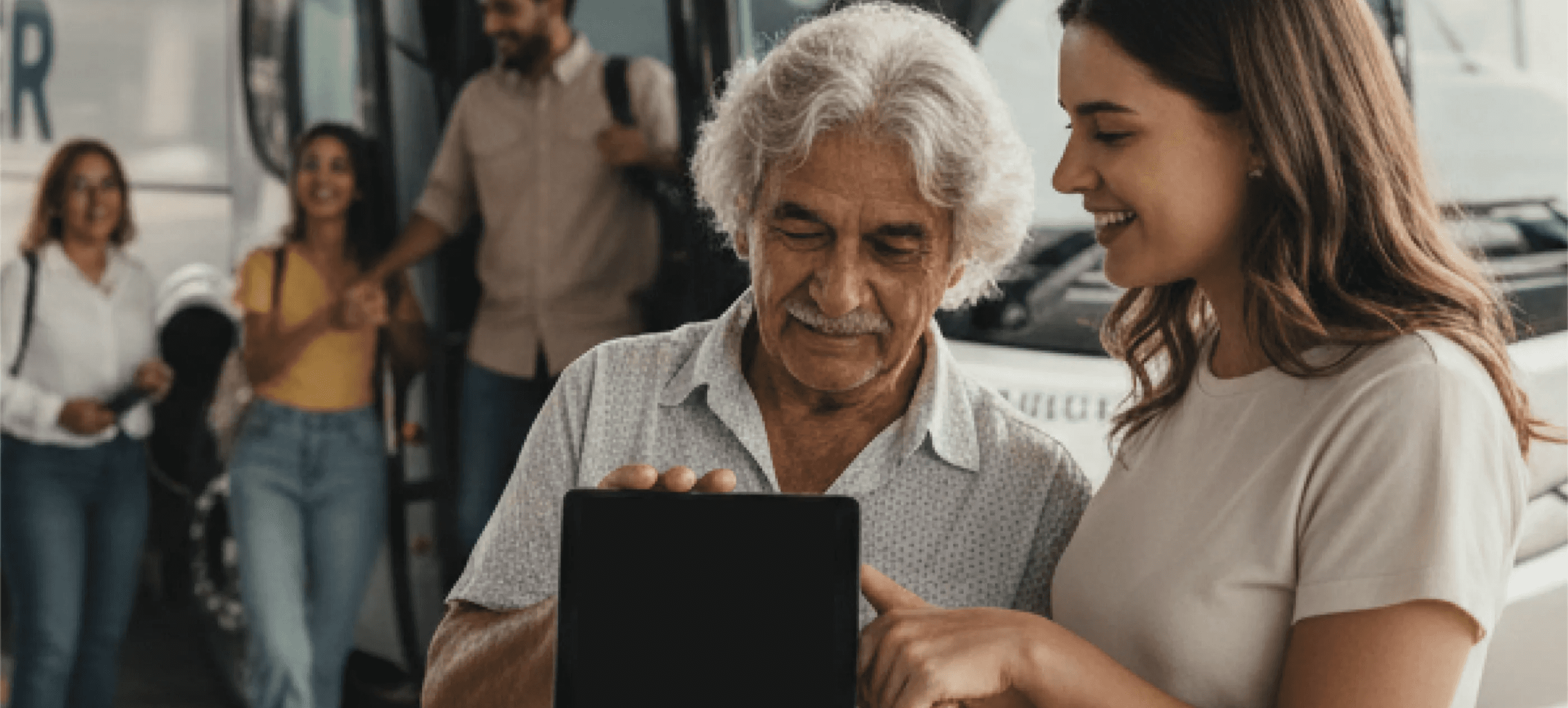
A Buser chegou ao mercado com uma proposta disruptiva: conectar passageiros a transportes fretados de forma simples, acessível e digital. O modelo funcionava, mas a experiência de compra não acompanhava o crescimento.
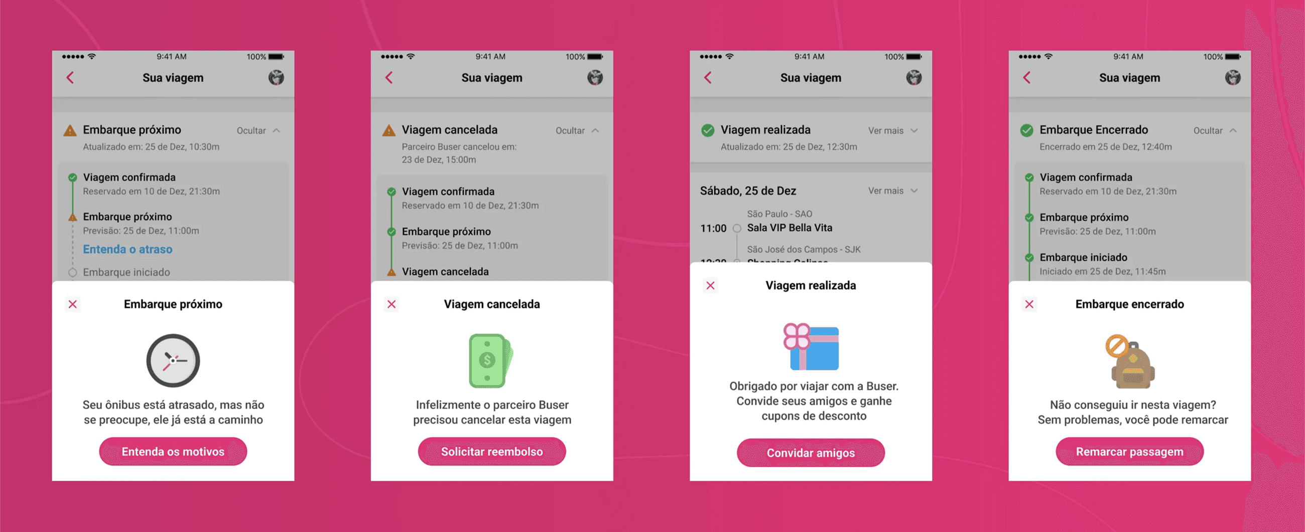
Em um negócio onde o produto é o canal de vendas, cada atrito na interface é uma perda direta de receita. Usuários abandonavam o fluxo por insegurança, ligavam para o suporte por dúvidas que a interface deveria responder, e chegavam ao embarque sem saber exatamente onde ou como embarcar.
Entrei na Buser em um momento de crescimento acelerado pós-pandemia, com o desafio de elevar a maturidade de design da empresa, tanto no produto quanto na cultura interna.
O Desafio
O primeiro desafio não estava nas telas. Estava na cultura.
Parte dos stakeholders C-level tratava design como execução visual. Algo para deixar bonito, não para decidir estratégia. Mudar essa percepção exigiu paciência, dados e resultados consistentes. Com o tempo, mostrei que design integrado ao negócio e à tecnologia não é custo: é vantagem competitiva.
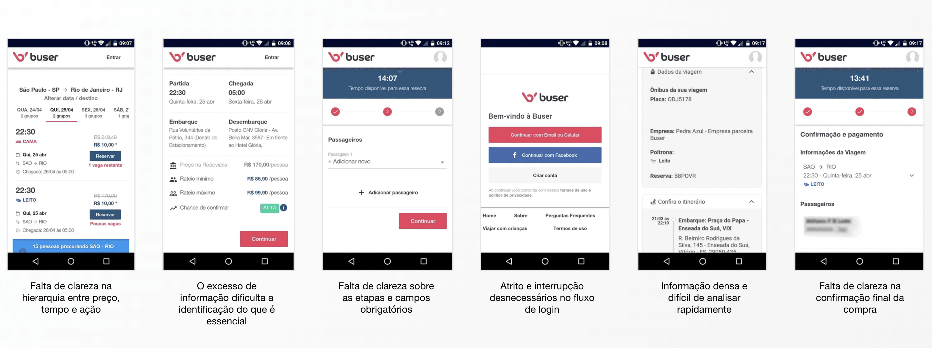
No produto, o cenário era igualmente complexo. A interface tinha problemas estruturais que impactavam diretamente a conversão: hierarquia visual confusa, fluxo de compra com alta taxa de abandono, falta de clareza nas informações de embarque e uma jornada que gerava ansiedade em vez de confiança.
Em paralelo, assumi a liderança de um time de 8 designers que já faziam parte da empresa. O desafio ali era diferente: estruturar governança, criar ritos, definir métricas de time e construir uma área que operasse com mais autonomia, consistência e propósito estratégico e não apenas entregando telas por demanda.
Meu papel
Atuei em duas frentes simultâneas: produto e liderança.
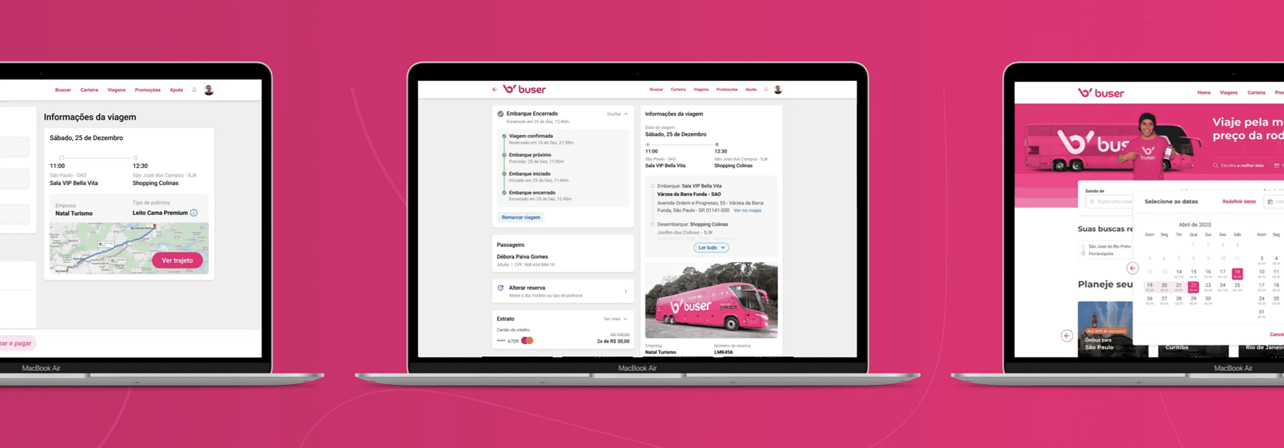
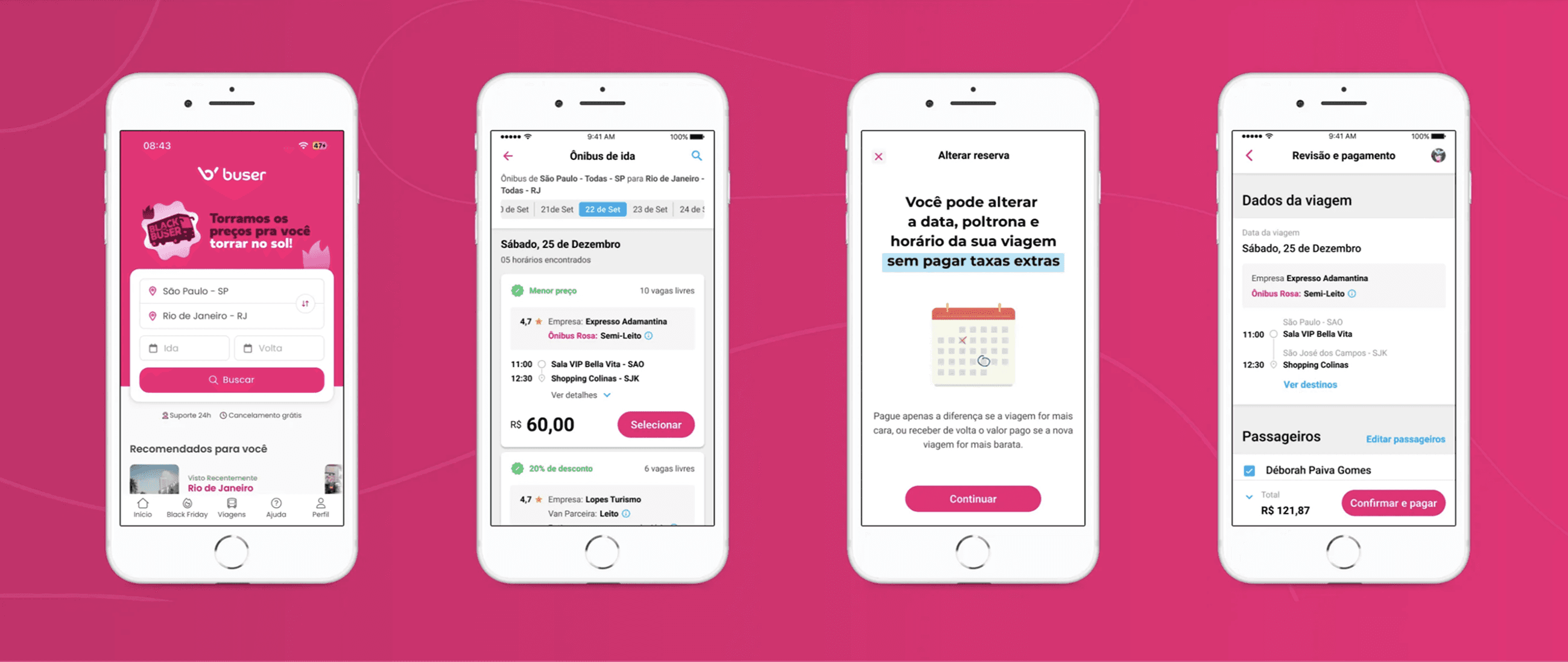
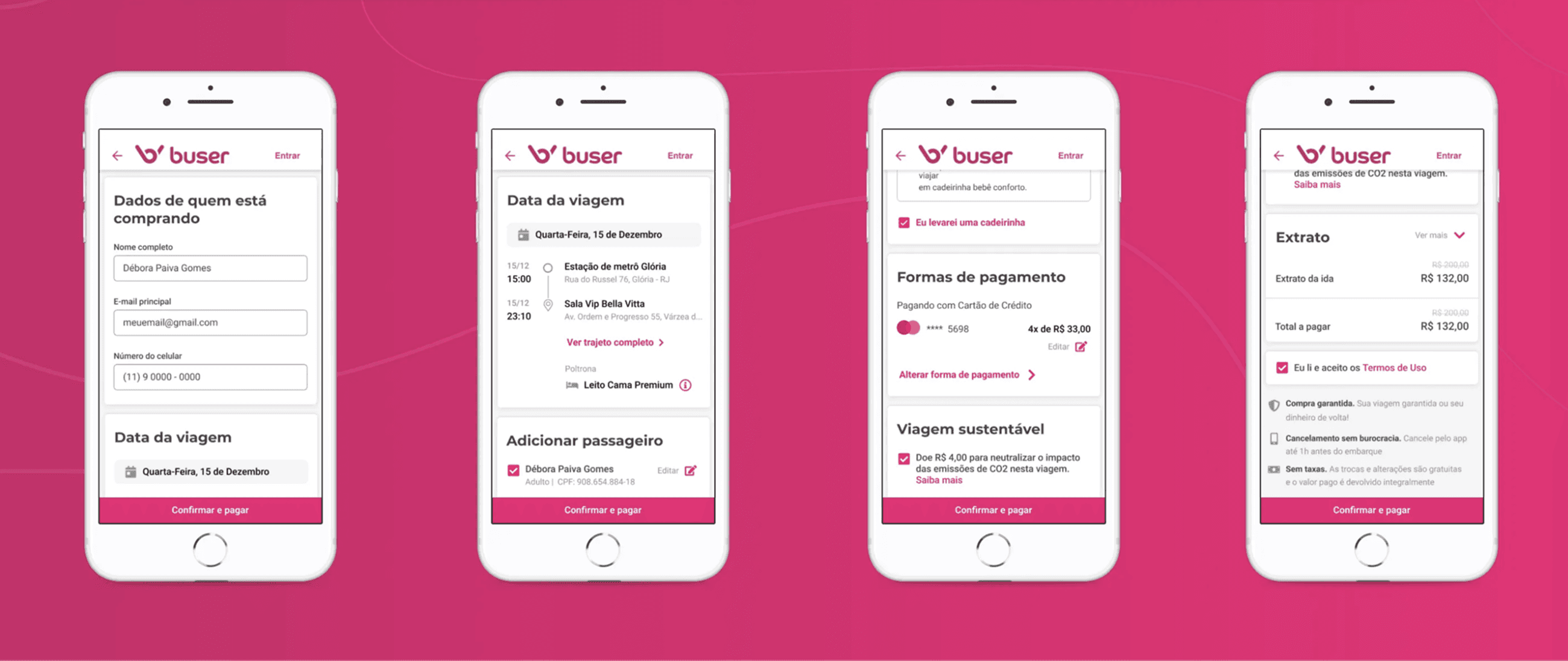
No produto, conduzi o redesign completo da experiência de compra: da busca ao desembarque. Mapeei a jornada existente (AS-IS), identifiquei os pontos de fricção com análise heurística e dados, defini os princípios que guiariam todas as decisões de interface e trabalhei com o time na construção da experiência futura (TO-BE).
Também atuei diretamente na criação de wireframes, UI, UX Writing, ilustrações, estados de interação e no desenvolvimento e evolução do Design System Andromeda — garantindo que as decisões de design fossem escaláveis e consistentes em toda a plataforma.
Na liderança, estruturei a governança do time: ritos de trabalho, critérios de priorização, métricas de qualidade e processos de alinhamento com produto e tecnologia. Atuei como agente de mudança cultural, apresentando resultados, conectando decisões de design a impacto de negócio e construindo credibilidade com os stakeholders que antes eram neutros ou detratores da área.
Aprendizados
O maior aprendizado foi sobre onde a mudança começa. Redesenhar a interface foi o trabalho visível, mas o trabalho real foi convencer as pessoas certas de que design estratégico gera resultado. Sem essa virada cultural, qualquer melhoria de produto seria tratada como cosmética.
Aprendi também que confiança do usuário não se constrói em um ponto da jornada, ela se acumula ao longo de cada interação. Uma busca clara, um checkout sem surpresas, uma notificação de atraso com linguagem humana. Cada detalhe comunica algo. Quando a interface falha em qualquer um desses momentos, o dano é maior do que o dado que aparece no dashboard.
E aprendi sobre liderança em contexto de pressão: dar autonomia ao time não significa se afastar. Significa criar as condições para que cada designer saiba o que priorizar, por que aquilo importa e como sua entrega se conecta ao todo.
Resultados
Além dos números do produto, a área de Design saiu de uma posição de suporte para parceira estratégica do negócio, com voz ativa nas decisões de produto, métricas próprias de impacto e um time que operava com mais maturidade, autonomia e propósito.

Explore o case completo
Quer ver como tudo aconteceu?
No case completo, detalho o processo de ponta a ponta: a pesquisa com viajantes e parceiros, os principais problemas de experiência que encontramos, as decisões de design que transformaram a jornada de compra e embarque, e os aprendizados de desenhar para um modelo de negócio que desafiava o transporte rodoviário tradicional.
−42%
atendimento telefônico sobre o status da viagem
−48%
dúvidas relacionadas à localização
+31%
na taxa de conclusão de pagamento


