
Itaú Corretora
O design que envelheceu bem: como o Itaú Corretora virou referência de usabilidade

Introdução
O Itaú Corretora precisava de um app à altura da sua base de investidores: moderno, confiável e capaz de competir com plataformas profissionais. Como UX/UI Designer liderando o redesign, integrei estratégia, pesquisa e design de interface para reconstruir a experiência de ponta a ponta, tornando cada ação de investimento mais clara, mais rápida e mais confiável.
Este case conta como uma frase dita por um investidor mudou o rumo do projeto, e como as decisões que tomamos em 2015 anteciparam padrões que o mercado só consolidaria anos depois.
O ponto de partida (e o primeiro erro)
Começamos pelo caminho mais óbvio: usar uma das marcas mais reconhecidas do mundo. A primeira proposta seguia à risca o visual institucional do Itaú — tons de laranja, ícones grandes, cores vibrantes.
Bastaram as primeiras conversas com usuários para percebermos que esse não era o caminho.
Uma única frase mudou o projeto inteiro:
“Isso parece um aplicativo de criança”
Quem disse isso foi um investidor experiente, acostumado a operar em plataformas como Bloomberg e Home Broker. E ele tinha razão.
Investir é um exercício de tomada de decisão, leitura e precisão — e a linguagem visual daquele protótipo não comunicava nada disso. Naquele momento, o papel do design deixou de ser "seguir o manual da marca" e passou a ser construir confiança.

Redefinindo o problema
A maior lição deste projeto foi entender que design não é manter uma identidade, é traduzi-la.
Traduzir a identidade do Itaú para o universo dos investimentos significava repensar a linguagem visual, a arquitetura de informação e até a densidade de elementos em tela.
O novo objetivo ficou claro:
"O investidor precisa sentir que está no Itaú — mas operando em uma plataforma profissional de investimentos."
Isso nos levou a repensar a experiência inteira:
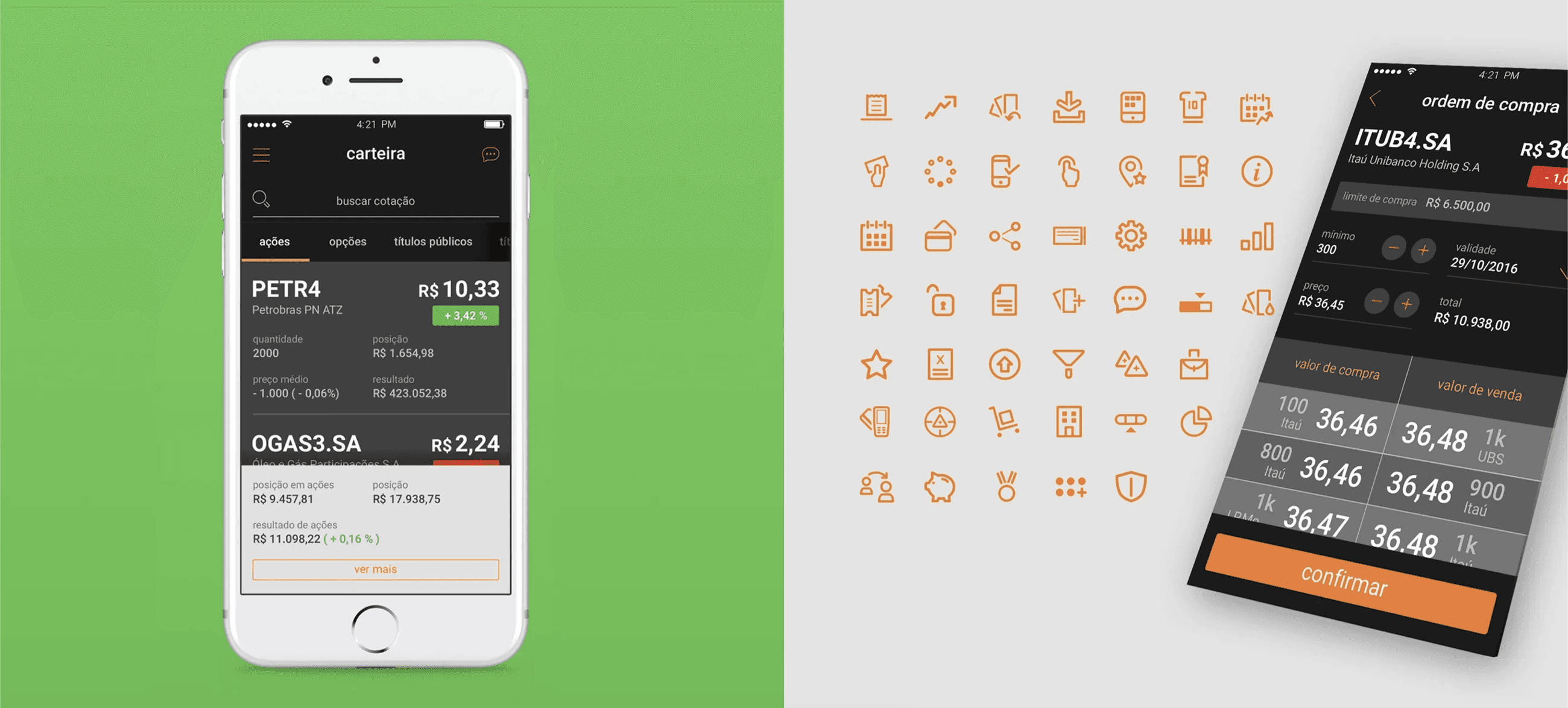
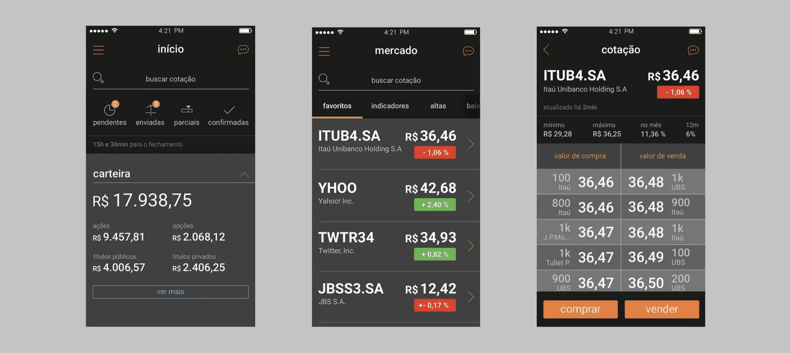
Redesenhamos os fluxos de navegação e a arquitetura de informação, eliminando cliques desnecessários e encurtando o caminho até a decisão.
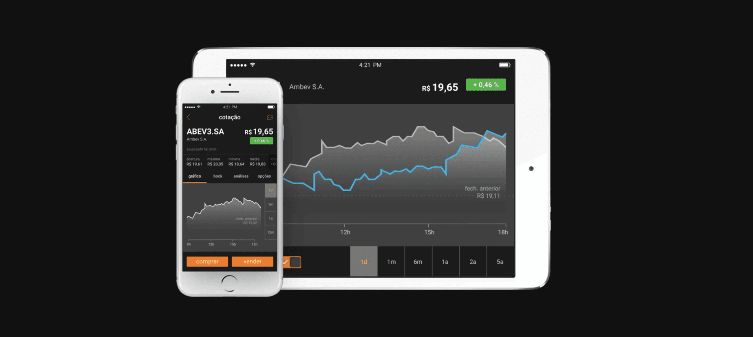
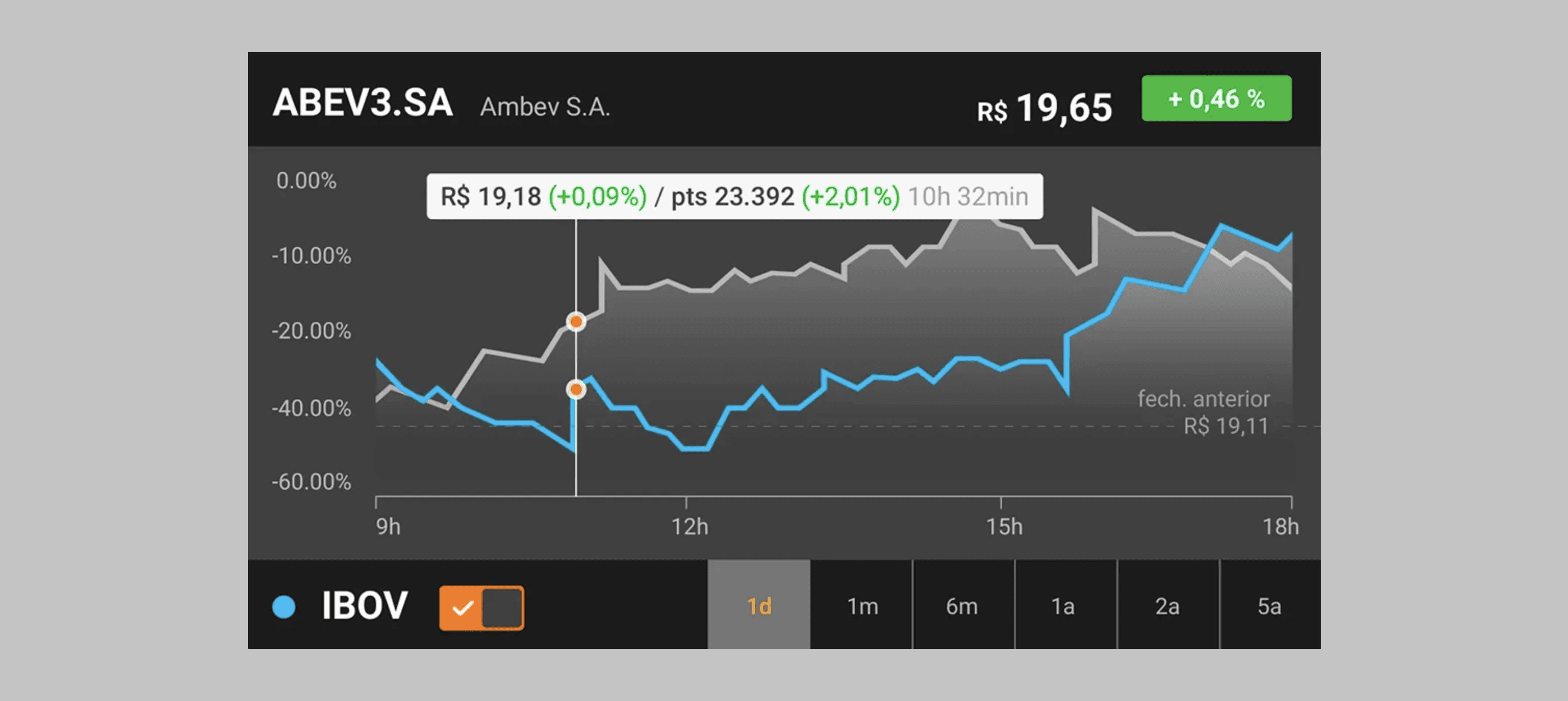
Criamos gráficos interativos e responsivos, com visual limpo e centrado nos dados — a informação como protagonista, não a decoração.
Desenvolvemos mais de 250 ícones customizados, em colaboração com o time de design gráfico do Itaú e a Ana Couto Branding.
E, principalmente, introduzimos uma linguagem de interface escura, focada em legibilidade de dados e concentração do usuário — algo raríssimo em 2015.
Antes do DesignOps ter nome
Hoje chamamos de DesignOps. Na época, era só trabalho em equipe e determinação.
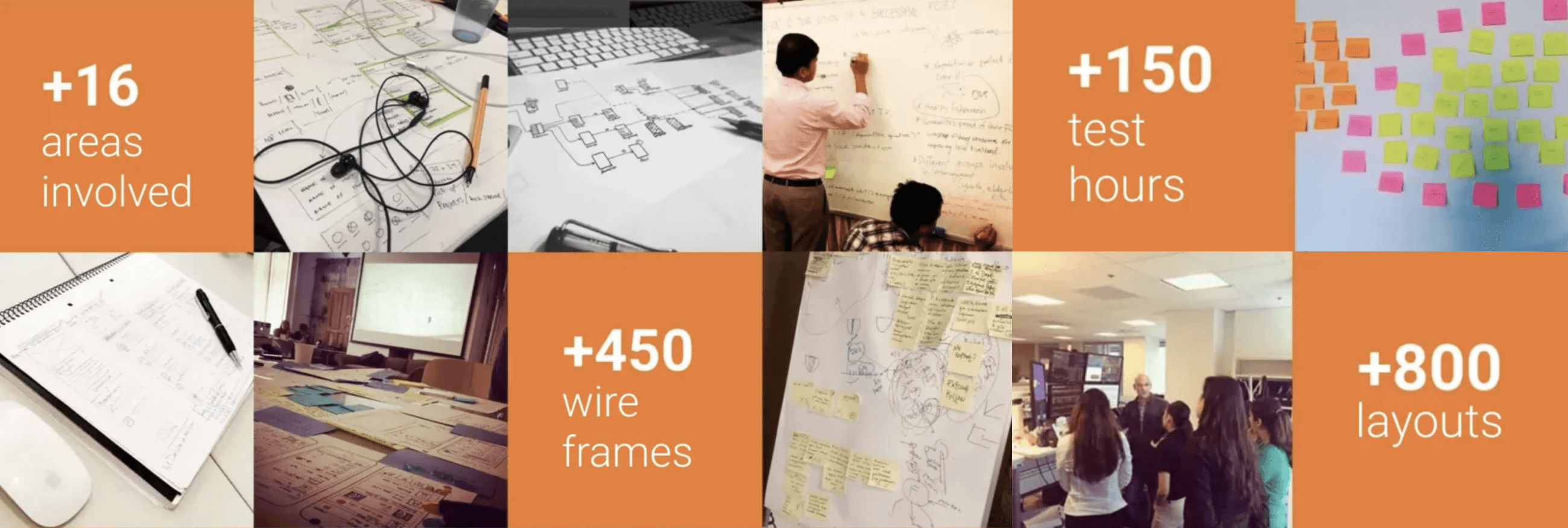
Foram mais de 16 áreas envolvidas, 450 wireframes, 150 horas de teste e mais de 800 explorações de layout. Trabalhamos em ciclos curtos, validando cada decisão com usuários reais e stakeholders de negócio. Os testes incluíam investidores de todos os perfis — de traders experientes a pessoas que nunca haviam comprado uma ação.
A cada sprint, refinávamos microinterações e testávamos hipóteses sobre contraste de cores, densidade de informação, feedback visual e acessibilidade. Estávamos aprendendo o tempo todo — e, sem saber, aplicando práticas que anos depois se tornariam padrão de mercado em UX.
*Em 2015, pouquíssimos bancos brasileiros aplicavam testes com usuários em produtos financeiros. Segundo o estudo "UX in Banking: Global Benchmark 2015", do Nielsen Norman Group, apenas 28% das instituições testavam usabilidade com clientes antes do lançamento.
Form follows function: uma identidade entre clareza e emoção
A nova identidade visual nasceu do equilíbrio entre rigor funcional e personalidade de marca:
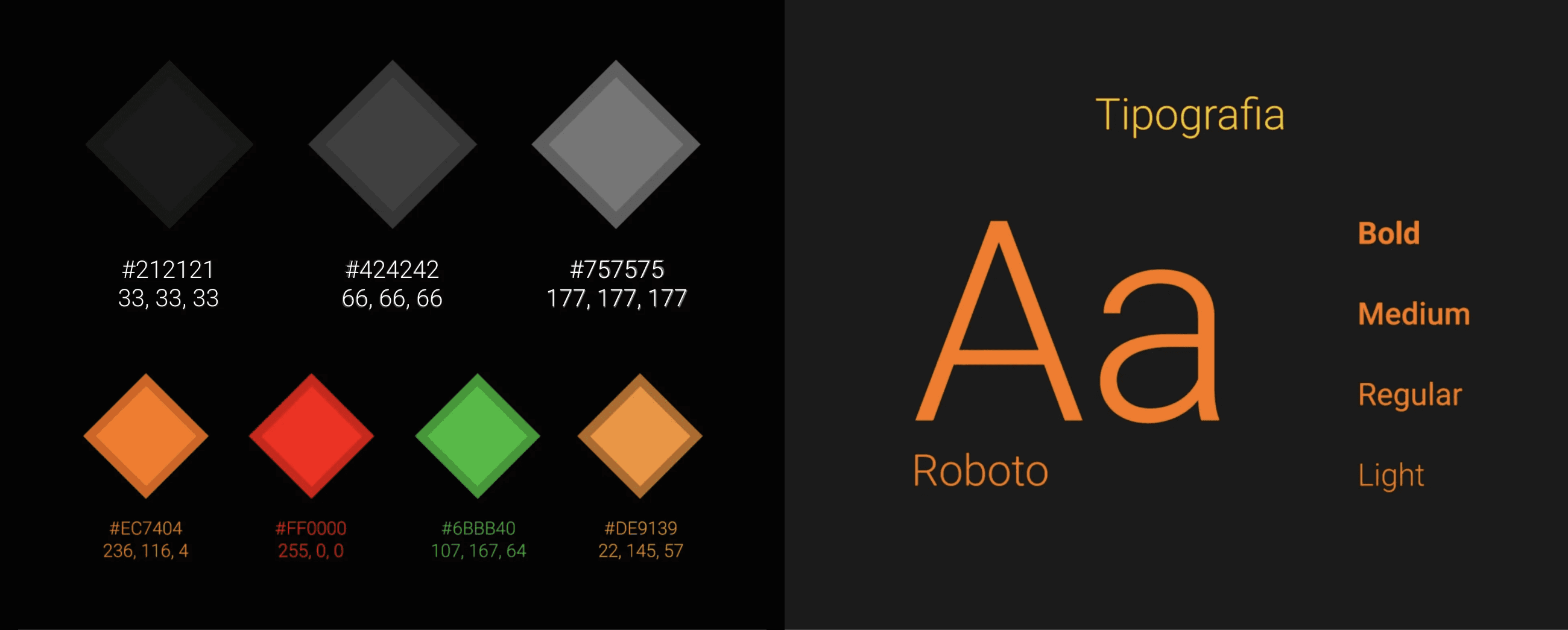
A paleta escura trouxe o foco para os dados, enquanto o laranja característico do Itaú preservou a familiaridade com a marca.
Verde e vermelho foram calibrados para leitura rápida de variações — intuitivos, sem ruído visual.
A tipografia Roboto, recém-introduzida no Android, garantiu legibilidade e consistência entre plataformas.
O resultado foi um design funcional, elegante e acessível — antes mesmo de "dark mode" virar tendência.
*Curiosidade: o dark mode só se popularizou no iOS em 2018 e no Android em 2019 (Google Design, 2019). Nós chegamos lá quatro anos antes — não por estética, mas por função.
O impacto
Na época, o Itaú Corretora se destacou por entregar uma experiência intuitiva e fluida, algo incomum no setor financeiro. Os gráficos comparativos, as telas simplificadas e o uso inteligente de cor transformaram o app em benchmark interno de excelência em usabilidade.
O mais interessante é olhar para os apps de investimento de hoje — do Nubank à XP — e reconhecer os mesmos princípios aplicados:
Alto contraste e foco nos dados;
Microinterações sutis e funcionais;
Dark UI como símbolo de profissionalismo.
A diferença é que, em 2015, tudo isso ainda era experimental.
2015 x 2025 — o design que resistiu ao tempo
Tema | 2015 | 2026 |
|---|---|---|
Design System | Quase inexistente | Fundamental |
User Research | Presencial e pontual | Remota e contínua |
Mobile Banking | Secundário | Núcleo do ecossistema |
Dark UI | Arriscado | Padrão |
Acessibilidade | Pouco discutida | Prioridade |
O que mais me orgulha é perceber que, mesmo depois de toda essa evolução, o Itaú Corretora envelheceu com elegância. As decisões que tomamos lá atrás — fundamentadas em pesquisa, empatia e clareza — continuam fazendo sentido hoje.
*Segundo o Digital Experience Survey da McKinsey (2024), empresas que amadurecem suas práticas de UX aumentam o engajamento digital em média 33% e reduzem o tempo de conversão em produtos financeiros em 25%.
Aprendizados
Este projeto me ensinou que design é escuta e tradução. Que estética sem propósito é apenas ruído. E que o melhor design é aquele que muda a percepção do cliente sobre o produto e sobre si mesmo.
*No início, o Itaú queria um app com a cara do banco. No final, o banco ganhou um app com a cara dos seus investidores.
______________________________________________
Resultados
Como consequência direta das melhorias de usabilidade e arquitetura de informação, o projeto alcançou resultados expressivos:
Indicador | Antes do Redesign | Depois do Redesign | Variação |
|---|---|---|---|
Taxa de conclusão de compra/venda de ações | 61% | 89% | +46% |
Tempo médio para executar uma operação | 2min 40s | 1min 10s | -56% |
Satisfação geral do usuário (NPS interno) | 54 | 82 | +28 pts |
Taxa de erro no fluxo de cadastro | 17% | 5% | -70% |
Bons designs não envelhecem.
Eles evoluem sem perder o propósito.
👋
+46%
aumento na conclusão de pedidos
–56%
redução no tempo de execução
–70%
menos erros em fluxos críticos


